At the risk of immediately losing some visitors to this post, I'm going to continue a recent post from my chess960 blog,
The Fascinating World of Chess960
(January 2023). There I wrote,
[Chess.com] has a good reputation for vigorously enforcing its no-engine policy, even if it leads to controversial decisions.
[...]
I switched to Chess.com in May 2022, playing one or (maximum) two games of correspondence chess at a time.
[...]
So far I've played about a dozen games on Chess.com, never once tempted to use an engine.
[...]
That's the background for a series of posts that I plan to write for my games on Chess.com. There are several aspects to be covered, e.g.
Game review tools.
So here we are. The Chess.com game review tools appear to be the same for both traditional chess and chess960. Good thing, too, because the navigation of the tools is so unintuitive that I wouldn't want to learn two different methods.
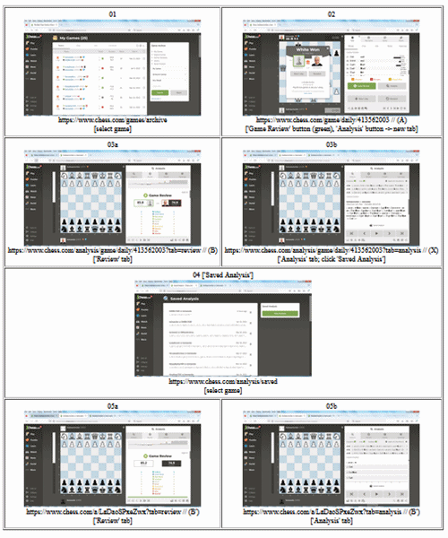
I spent some time finding my way around the tools and decided to document my understanding in the infographic shown below. I'm sure it will help me in further explorations and it might help others trying to do the same.
The starting point for a game review is the archive,
The Best Chess Games of [Me, Myself, and I]
(chess.com). In the following examples, 'Me, Myself, and I' means my bemweeks account on Chess.com.
[NB: This seems like the right place to interject a big nota bene. Everything I say in this post describes how I understand the tools *now*. The tools might change tomorrow, or the day after tomorrow, and it is nearly certain that a year from now they will be different. On top of that, I might have overlooked something obvious that renders my remarks wrong. If I make a mistake, I'll correct it here. If something changes later, I probably won't document it here.]
The window on the top left of the graphic ('01') shows the archive of my games. Selecting a game from the list opens a new window for that game ('02'). The game window has two large buttons for further analysis. The green button on the left opens a 'Review' tab on an 'Analysis' window ('03a') and the gray button next to it opens an 'Analysis' tab on the same window ('03b'). The two new tabs are part of the same display, allowing an easy switch between the two.

(Expand for more readable view)
The game I'm using for the example is the first chess960 correspondence game I lost on Chess.com last year. I used the game review tools for the first time in an attempt to discover where I had gone wrong. A discussion of that game's ins-and-outs is better left for my chess960 blog.
The 'Analysis' tab ('03b') has a link called
Saved Analysis
(chess.com). It leads to a 'Saved Analysis' window ('04') where individual games can be selected. Selecting a game opens a 'Review' tab on another 'Analysis' window ('05a'), that looks similar to ('03a'). It also offers an 'Analysis' tab ('05b'), which displays the notes I made as the game was being played -- recall that this was a correspondence game.
The '03' and the '05' windows have competely different URLs. I haven't used them enough to determine if they offer different functionality. That will be the subject of another post, along with a comparison of windows '02', '03a', and '05a'.
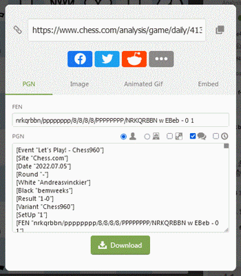
Most (all?) of the game windows offer the option of downloading the PGN for the game. Window '02' has two options, 'Share' and 'Download', which appear to be identical. The downloaded PGN has the game score only, without variations.
Window '03a' has only a 'Share' option. The downloaded PGN includes variations incorporating the same notes already mentioned in '05b'.
Window '03b' also has a 'Share' option only. Its behavior is somewhat peculiar. When '03b' is first opened, it displays the moves of the game under review. If it is opened a second time, after switching to '03a' for example, it displays the notes to the game as in '05b'. The PGN behaves similarly. When the tab is first opened, it offers only the game score; when opened a second time, it offers all of the notes.
Confusing? Sorry about that. The functionality described above was probably developed at different times, perhaps by different people, without paying much attention to the interface that already existed. Better too much than too little some people might say.
 Last week, in


 It's hard to believe, but in the nearly 17 years that I've been writing this blog and the nearly 13 years that I've been posting for the series titled


